What an Upside-Down State Sticker Really
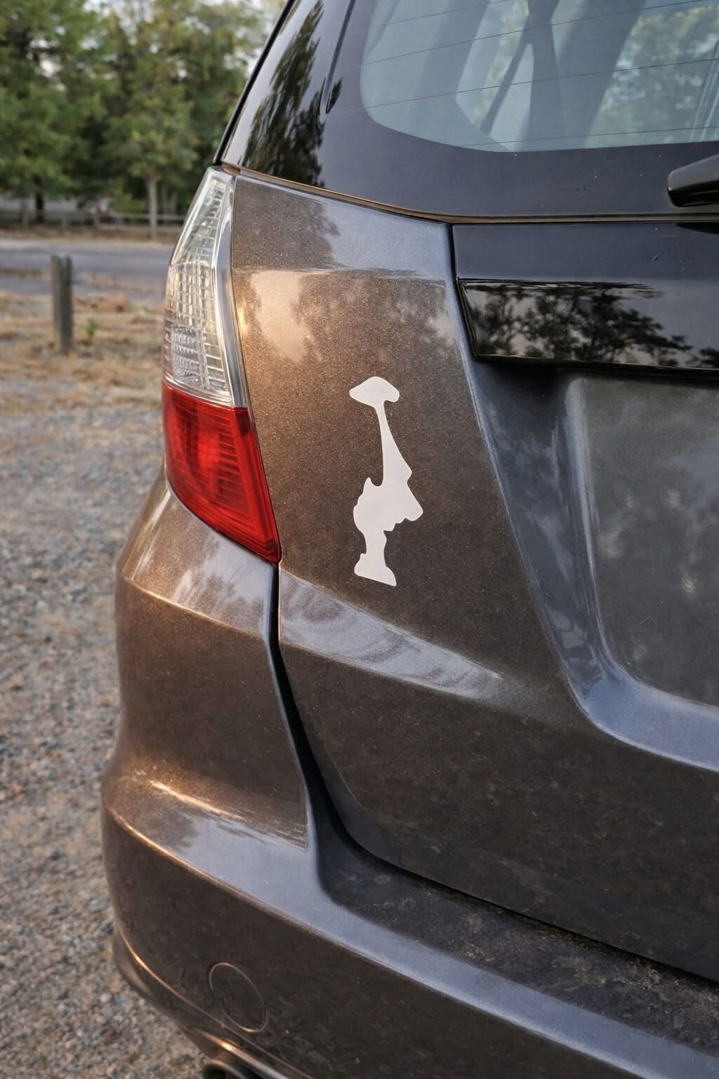
If you spend time driving throught the Pacific
Northwest, you might notice a unique symbol on
bumpers, water bottles, and laptops—the outline of Washington state displayed upside down.
At first, it may look like an error, but the more often you see it, the clearer it becomes that the design is intentional.
For many residents, this simple flipped outline has grown into a subtle and meaningful expression of
local identity and shared humor.
The design became popular in the early 2010s, when minimalist state-outline stickers began appearing across the United States.
In Washington, the state’s clean rectangular shape made it easy to recognize, even when inverted.
Flipping it gave the design a fresh and creative twist.
Over time, what started as a playful variation evolved into a quiet symbol embraced by locals.
It gained traction among outdoor enthusiasts, students, and people who felt a strong connection to the region’s landscapes and culture.
There are a few different interpretations behind the upside-down look.
One lighthearted explanation ties it to the region’s well-known rainy weather, with people joking that the state has been “flipped” by the constant rain.
Others see it as a low-key way to show pride—something recognizable without being overly bold.
Some even point out that the inverted shape can resemble a mountain peak, reflecting the
influence of natural landmarks like Mount Rainier and the surrounding ranges.